| SASH BARS; BLACK OR WHITE? | |||||||||||

|

| ||||||||||
| Recently repainted houses houses in nearby Cannonbury Road, Islington showing typical white woodwork and white or cream render | |||||||||||
|
The use of white paint on exterior woodwork is so common these days in late Georgian and early Victorian townhouses that most of us use it without thinking. I was therefore intrigued when our architect suggesting using black for the sash bars and window frames of our 1840s stucco fronted semi. She said that it let the building’s features be “read” better; painted black, the eye sees the window openings more as single voids in the volume of the building whereas white sash bars have the effect of stopping the eye and making the window seem like part of the wall surface. I was not entirely convinced so I decided to do some research. |
|||||||||||
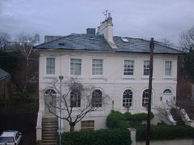
A view of the other side of the road from our house. Beautifully decorated and a model of cooperation between neighbours, but how authentic is it? | |||||||||||
|
A few months previously I had been looking for pre-war photographs of my street at the local library and in the Greater London Record Office in an attempt to discover what type of railings the house once possessed. Although I found no photographs of my side of the street I did find some of the rather grander houses opposite. One of these is reproduced below, together with a snapshot of the same house today. | |||||||||||

Pre-war |

Now | ||||||||||
|
Comparing the house then and now I was struck by a number of differences. The house in the older photograph looks more formal and somehow more substantial. It is not possible to tell from the black and white image what colours had been used but all the woodwork is clearly dark. This of course was no proof of the original scheme as the photo must have been taken nearly 100 years after the house was built, but it did suggest a different aesthetic. The next piece of evidence came from stripping one of my basement sash windows. Underneath the white paint was a dark green and below that a black or very murky brown. There was certainly no trace of pale coloured paint in the lower layers. The window was in bad shape and thickly encrusted so there is a fair chance that the lower layers dated from the 19th century. The use of dark green for window frames seems to have been common in the first part of the 20th century and may have been the colour at the time the black and white photo was taken. Very few local buildings have green windows now so it is difficult to judge what it may have looked like. The picture below taken from my bus on the way to work gives some idea of the effect. | |||||||||||

| |||||||||||
|
Convinced now that we should try black for the windows my attention turned to the wall colour. My initial view was that we should use cream and pick out some of the architectural detail in white. This is the colour scheme used by many of our neighbours. I had an inkling however that this was not what the original look would have been. The stucco was clearly intended to imitate stone, and under all the layers and paint, sandtex etc one could still see traces of the lines where the stucco had been scored to imitate ashlar joints. I had the feeling that the original stucco might have been left unpainted and would have been a yellowy brown colour. I thought I had read a comment of John Summerson’s years ago that Georgian buildings in London would have resembled the colour of Bath stone, although whether he was referring to the colour of London Stock brick or Regency stucco I am not sure. What finally convinced me was a book on Regency decoration which showed a contemporary coloured illustration of a stucco townhouse; the walls were stone-coloured and the woodwork was dark. The author, Steven Parissien, described how window colours after 1800 could be quite varied, including black, grey and brown. This is how the terraces of Hove, Brighton and Regent’s Park must have looked when built - very different from today’s appearance. In fact some of the original leases for the Nash terraces call for repainting woodwork in simulated oak graining every four years. My wife did not take much convincing that we should try the colour scheme and the task of selecting the exact colours began. For the walls we eventually chose Farrow & Ball’s “String” and for the woodwork an exterior eggshell, also from Farrow & Ball, called “Umbrello Black”. Our decorator preferred a different brand of emulsion so in the end we used that, made up in a similar colour.
|

| 
Our house before redecoration (left) and after (right).
|
| The reaction of our neighbours has been muted. No one has said they actively dislike it but no one has yet dashed out and repainted their house in our colours. One resident of the street told us that we should not have painted the house in such contrasting colours to those of our attached neighbour, which is a fair point. I have since noticed more dark colours being used, mainly it seems by Georgian enthusiasts in the East End.
| 
Two Georgian houses in Stepney; sandwiched between a superstore carpark and the deafening traffic of the Mile End Road they are good examples of the dedicated restoration work of Georgian enthusiasts
|
When we get round to replacing our front railings and gate we will face the next question; paint them black like everyone else or matt green in imitation of weathered bronze? References: John Summerson, Georgian London Steven Parissien, Regency Style | |||||